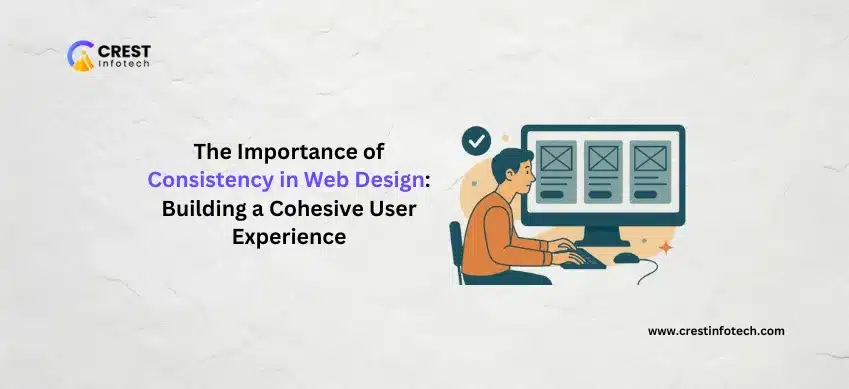
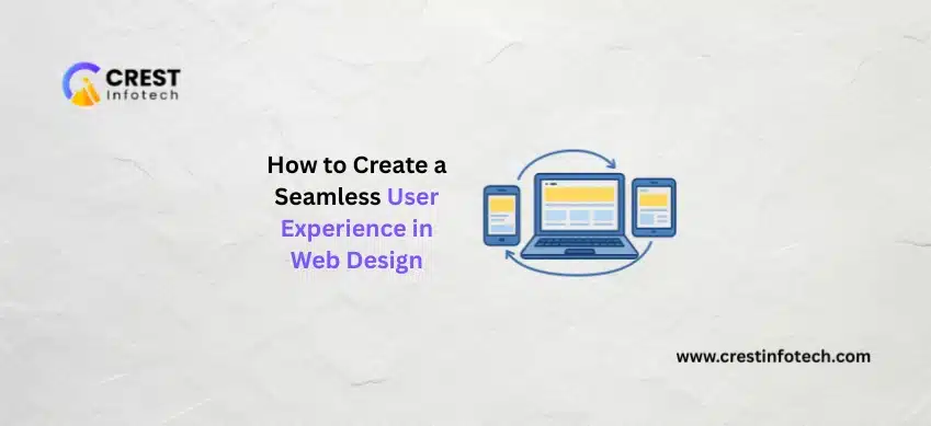
A seamless user experience (UX) is the foundation of successful web design. A visually attractive website alone is not enough—users expect fast loading, intuitive navigation, accessibility, and consistency across all devices. At Crest Infotech, we design user-centric websites that focus on usability, performance, and engagement. This article explains key principles and best practices to create […]

 I am the Founder of Crest Infotech With over 18 years’ experience in web design, web development, mobile apps development and content marketing. I ensure that we deliver quality website to you which is optimized to improve your business, sales and profits. We create websites that rank at the top of Google and can be easily updated by you.