
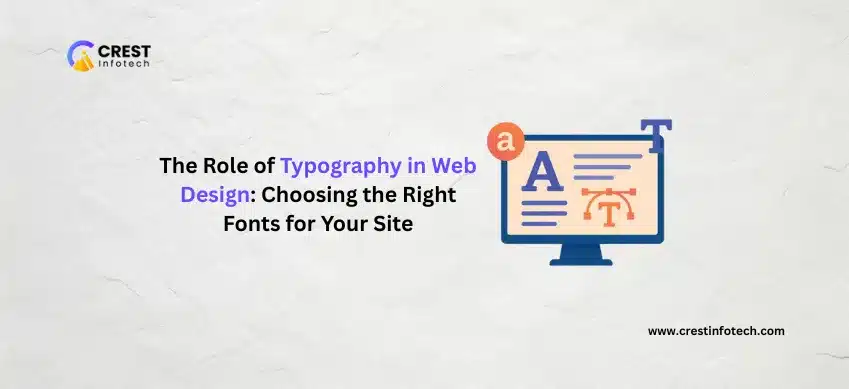
In web design, typography isn’t just about aesthetics — it directly impacts user experience, brand identity, and even conversion rates. The right typeface can express your brand’s voice, improve readability, and keep visitors engaged.
1. Why Typography Matters
Typography has a direct effect on how visitors perceive and interact with your content.
- First Impressions: Fonts help communicate your brand’s personality within seconds.
- Readability: Clear typography ensures content is easy to consume across devices.
- Hierarchy: Proper type structure guides users through your content naturally.
2. Understand Font Types
Choosing the right category of font can reinforce the tone of your site.
- Serif: Classic and professional (e.g., Georgia, Times New Roman).
- Sans-Serif: Clean and modern (e.g., Helvetica, Open Sans).
- Script: Elegant and expressive (e.g., Great Vibes, Pacifico).
- Display: Bold and decorative — ideal for headlines and branding.
“Typography is the voice of your design — make sure it speaks clearly and with purpose.”
3. Tips for Choosing the Right Fonts
Keep these best practices in mind when selecting fonts for your website:
- Limit yourself to 2–3 font families site-wide
- Ensure sufficient contrast between text and background
- Use font sizes and weights to establish visual hierarchy
- Always test readability on mobile and desktop
4. Consider Performance and Accessibility
A beautiful font is meaningless if it slows your site or creates barriers for users.
- Web-safe fonts: Choose fonts optimized for browsers and load speed
- Google Fonts: Free, fast-loading, and widely supported
- Accessibility: Avoid fonts that are overly stylized or hard to read
5. Maintain Consistency Across Your Brand
Typography is a key piece of your visual identity. Consistency builds trust.
- Use the same font family across your website, emails, and marketing
- Define rules in a style guide (e.g., headings, paragraph spacing, line height)
- Stick to your type hierarchy for every page and template
“Great typography is invisible — it supports content without distracting from it.”
Final Thoughts
Typography is a foundational element of web design that influences everything from aesthetics to usability. Choosing the right fonts means understanding your audience, your brand, and the message you want to deliver. When done thoughtfully, typography enhances the entire user journey — making your site not only look good but feel good to read.
Start with clarity. Prioritize readability. Stay consistent. And let your type do the talking.