In today’s digital world, mobile usage has surpassed desktop browsing. A website that isn’t mobile-friendly risks losing customers, ranking lower on search engines, and delivering a poor user experience. At Crest Infotech, we specialize in building responsive, high-performance websites that adapt beautifully to all screen sizes. This guide outlines the essential tips and techniques you need to create a truly responsive and mobile-ready website.
1. What Is Responsive Web Design?
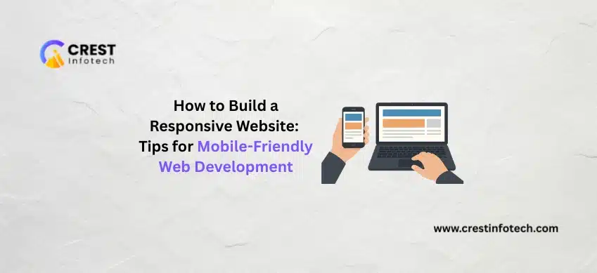
Responsive web design ensures your website automatically adjusts its layout, images, and content based on the user’s device. Whether viewed on a mobile phone, tablet, or desktop, the experience remains smooth and visually appealing.
A responsive website must:
-
Resize content proportionally
-
Rearrange layout efficiently
-
Maintain readability and usability
-
Load quickly across devices
2. Why Responsive Design Matters
✔ Majority Users Browse on Mobile
More than half of global web traffic comes from mobile devices—your website must perform flawlessly on small screens.
✔ Boosts SEO Rankings
Google prioritizes mobile-friendly sites, improving visibility and organic traffic.
✔ Enhances User Experience
Responsive design reduces friction, increases engagement, and improves conversion rates.
✔ Cost-Effective
One website works on all devices—no need for separate mobile websites.
3. Core Principles of Responsive Website Development
1. Fluid Grid Layouts
Use percentage-based widths instead of fixed pixels. This allows content to scale naturally on any screen.
2. Flexible Images & Media
Images should adjust to different screen sizes using CSS properties like:
3. Media Queries
Media queries allow developers to apply specific styles based on device characteristics such as width and resolution.
4. Mobile-First Approach
Start designing for mobile screens first, then scale up for larger devices. This leads to cleaner layouts and faster loading.
5. Touch-Friendly Design
Ensure buttons, menus, and elements are easy to tap with fingers.
Recommended minimum size: 44 × 44 px.
4. Performance Optimization for Mobile Devices
A responsive website must also be fast. Key optimization techniques include:
✔ Optimize Images
Use modern formats like WebP and compress images without losing quality.
✔ Minify CSS and JavaScript
Reduce file sizes to improve loading speed.
✔ Use a Content Delivery Network (CDN)
Serve static files faster to global users.
✔ Enable Browser Caching
Allows repeat visitors to load pages instantly.
✔ Lazy Loading
Loads images only when they are about to be viewed.
5. Testing Your Responsive Website
Before launching, thoroughly test across multiple devices and browsers.
Test on:
-
Android & iOS devices
-
Tablets
-
Laptops & large screens
-
Chrome, Edge, Safari, Firefox
Use tools like:
-
Google Mobile-Friendly Test
-
BrowserStack
-
Chrome DevTools Responsive Mode
6. How Crest Infotech Helps You Build Mobile-Friendly Websites
At Crest Infotech, we deliver high-quality, mobile-optimized websites tailored to your business needs.
Our Responsive Web Development Services Include:
-
Custom website design
-
Mobile-first UI/UX
-
Responsive frontend development (HTML, CSS, React, Vue)
-
Backend integration (Node.js, PHP, Laravel, Python)
-
Performance optimization
-
Cross-browser and multi-device testing
-
SEO-friendly design
-
eCommerce & CMS development (Shopify, WordPress, Magento)
Why Businesses Choose Us
-
17+ years of experience
-
Pixel-perfect, device-friendly design
-
Fast turnaround time
-
Affordable development solutions
-
Dedicated team for updates & support
Final Thoughts
A responsive website is no longer optional—it’s essential for engaging users, improving conversions, and growing your digital presence. With the right techniques and a skilled development team, you can provide a seamless experience across all devices.
At Crest Infotech, we create responsive, future-ready websites that help your business stand out in the digital world.
 I am the Founder of Crest Infotech With over 18 years’ experience in web design, web development, mobile apps development and content marketing. I ensure that we deliver quality website to you which is optimized to improve your business, sales and profits. We create websites that rank at the top of Google and can be easily updated by you.