
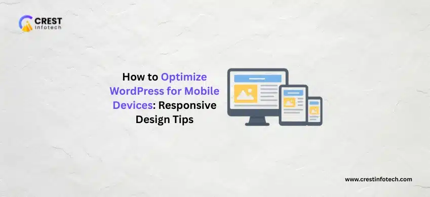
With mobile devices driving the majority of web traffic today, optimizing your WordPress site for smartphones and tablets is no longer optional — it’s essential. A responsive, mobile-friendly design not only enhances user experience but also boosts SEO rankings and engagement. Here’s how to make your WordPress site shine on every screen.
1. Choose a Responsive WordPress Theme
The foundation of mobile optimization starts with your theme.
- Select a theme that automatically adapts to different screen sizes
- Test themes on multiple devices before finalizing
- Use trusted marketplaces like ThemeForest or WordPress.org for quality themes
2. Implement a Mobile-First Design Approach
Designing with mobile users in mind ensures a smoother experience across devices.
- Prioritize essential content and navigation on small screens
- Use flexible grid layouts and scalable typography
- Test UI components like buttons and menus for touch accessibility
“Start with mobile, then enhance for larger screens — not the other way around.”
3. Optimize Images and Media for Mobile
Large, unoptimized images can slow down your site significantly.
- Compress images with plugins like Smush or ShortPixel
- Use modern formats like WebP for better performance
- Enable responsive image sizes using the
srcsetattribute
4. Simplify Navigation and Menus
Mobile users expect fast, easy navigation without clutter.
- Use a collapsible “hamburger” menu for smaller screens
- Limit top-level menu items for simplicity
- Ensure clickable elements have enough spacing for touch input
“Clear navigation means users can find what they need in seconds — not clicks.”
5. Improve Page Speed and Performance
Mobile users won’t wait for slow-loading pages. Speed is critical for retention and SEO.
- Use caching plugins like WP Rocket or LiteSpeed Cache
- Enable lazy loading for images and videos
- Minify CSS, JS, and HTML files for faster rendering
6. Use AMP (Accelerated Mobile Pages)
AMP helps deliver lightning-fast mobile experiences by simplifying your page’s structure.
- Install the AMP for WordPress plugin to enable AMP versions of pages
- Ensure your AMP pages maintain brand consistency
- Test AMP compatibility with analytics and forms
7. Optimize Typography and Readability
Small screens require clear, legible text that scales naturally.
- Use at least 16px for body text
- Choose web-safe, mobile-friendly fonts
- Maintain sufficient contrast between text and background
“Readable content keeps users engaged — poor typography makes them leave.”
8. Test Your Site Across Devices and Browsers
Testing ensures consistency and usability everywhere.
- Preview your site on iOS, Android, and different screen sizes
- Use tools like BrowserStack or Responsinator
- Check touch interactions, scrolling, and layout alignment
Final Thoughts
Optimizing your WordPress site for mobile is about creating seamless, fast, and user-focused experiences. By choosing a responsive theme, adopting mobile-first design, optimizing media, and improving site speed, you can ensure your website performs flawlessly across all devices. Remember — in today’s mobile-driven world, your site’s first impression is most likely happening on a phone. Make it count.
 I am the Founder of Crest Infotech With over 18 years’ experience in web design, web development, mobile apps development and content marketing. I ensure that we deliver quality website to you which is optimized to improve your business, sales and profits. We create websites that rank at the top of Google and can be easily updated by you.