RESPONSIVE WEB DESIGN
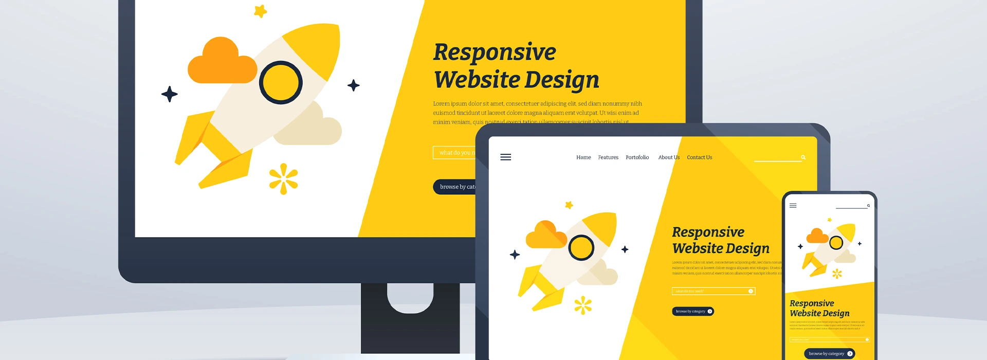
Responsive Web Design is a process of building a website design that works on devices of all the sizes like desktops, tablets, and mobiles. Moreover, Responsive Web Design has improved user experience and are compatible with all the browsers. Hence, responsive website design is a recommended pattern by all the leading search engines and web design experts.
Furthermore, Responsive web design helps to improve visibility over the Internet platforms and search engine platforms. Consequently, it gives the best user experience while surfing websites over mobile and tablet devices and desktop browsers.
Besides, the concept of Responsive Website Design is to react to the web user’s actions and provide the best possible user experience of website usability and readability. The process behind responsive web designing involves grid utilization, design layout system, image optimization, and CSS media queries. Therefore, no matter how many devices get released in the future with any size resolution, responsive websites will always work once set up.
- 42% of users say they feel frustrated and annoyed when they get to a website that’s not mobile-friendly.
- 46% said they felt like they’ve wasted off their time by visiting those sites which are not responsive or mobile friendly.
OUR COMMITMENT
- Our team of designers ensures that all website designs are fully responsive, ensuring that they are accessible and functional on all devices, including desktops, tablets, and smartphones.
- We use the latest technologies and design trends to ensure that the website looks modern and up-to-date while also being user-friendly and intuitive to navigate.
- We work closely with clients to understand their specific needs and design preferences, ensuring that the final product aligns with their brand identity and overall goals.
- Our designs are optimized for fast loading times, providing an optimal user experience and minimizing bounce rates.
- We provide ongoing support and maintenance services to ensure that the website continues to function optimally and remains up-to-date with the latest technologies and design trends.
- We prioritize accessibility and usability, ensuring that the website is easy to navigate and use for users with disabilities or other accessibility needs.
- We conduct thorough testing and quality assurance checks to ensure that the website works seamlessly across a range of devices and browsers, providing a consistent and reliable user experience.
- We take a collaborative approach, working closely with clients throughout the design process to ensure that the final product meets their expectations and requirements.
Why Should Choose Responsive Web Design?

REDUCES WEB PAGE LOAD SPEED
As responsive website design works on a concept of media queries, it reduces the page load time to a large extent. Consequently, users will have a quick loading website, which helps to achieve a better ranking in search engines.

SAVES TIME & COST
Responsive Web Design saves your time and costs both as you do not need to design your website for mobile devices again. Its enduring nature is unbelievable, valuable, and cost-effectiveness is a clear advantage.

INCREASE IN MOBILE USAGE
Because of a growing scenario, people are becoming mobile-reliant. And these days mobile is preferred over internet surfing. Furthermore, as per the search engine’s latest research, mobile internet users are increased by 58% in the last two years.
A RESPONSIVE WEB DESIGN IS NO LONGER A LUXURY. IT’S A NECESSITY TODAY.
Responsive web design has nowadays become a fundamental requirement for nearly all the websites’ design. Therefore, Crest Infotech offers a Responsive Web Design service to build a website apt for all screen sizes and devices. It gives an insightful and pleasing experience for one and all. In conclusion, it assures that your website runs well on all devices.
Most business organizations are progressively using Responsive web design to optimize their website design for users accessing different websites through different types of devices. However, there are many quite important reasons; which make us switch over to the responsive web design for a mobile website.